Graphics

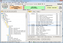
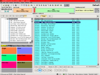
For "Now playing" it'll be enough to change brightness (what's already played is bright, and what not played is darker) - it'll look very good I hope. It won't overload interface with many different colors.

The idea to toggle Auto/Assist/Manual is good. Except for... we don't have "Live assist" mode yet =)
 
Thinking about it. I see absolutely no reason in this button.  Can you give me some situations which require pressing of Pause button? "I just want it to be there" is not a cause to keep this button.
 
Hey Djsoft

the reason why i would like you to keep the pause on there

is because of the video playback on radioboss

how can you pause the video playback without a pause button?
 
Hey chris

my SPL does not work for video display anymore

because everytime i play videos on my SPL now, it just shows a black screen of death now
 
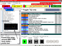
Another graphic layout, reclaiming real estate, by using toogle on the date and time/time remaining.

The items in the left of the playlist are an optional suggestion?

The PPM is a functional meter with correct ballistics and one of many available as an alternative to a simple (yet effective) bar-graph meter (ex Un4seen Developments?)

Maybe the meter is just too much of a whim, but the remainer is deadly serious... mostly

Chris in New Zealand
 

Attachments

  • 4.5.0.678 screen 44 Play.PNG
    4.5.0.678 screen 44 Play.PNG
    85.4 KB · Views: 658
saucerfoot said:
how can you pause the video playback without a pause button?
Ok, the Pause button will stay for now. I think we just add a new setting to hide/show control buttons.

Chris Diack said:
Maybe the meter is just too much of a whim, but the remainer is deadly serious... mostly
The meter looks very outdated... And consumes too much space. Couple of bars (as on previous screenshot) will be enough for now.
 
hello to everyone

my suggestions about the listview of the playlist:

1) it is possible show only the filename and not the full path+filename of the listview items?

for example is the item of the playlist is
''D:\My.music\Billboard Hot Songs (18.12.2010)\001-Train-Hey, Soul Sister.mp3''

do you think is possible show only ''001-Train-Hey, Soul Sister.mp3''
(the full path can be shown as a tooltip when you stay on an item for example)

2) can you consider to add more columns (means informations) on the same listview, i think to the bpm value, the rating of the song, the last played value and the playcount

best regards, Paolo


Hello!

Thanks for suggestion. Yes, the new columns will be added. The "Filename" column will be updated to show filename and full path like: "001-Train-Hey, Soul Sister.mp3 (D:\My.music\Billboard Hot Songs (18.12.2010)\001-Train-Hey, Soul Sister.mp3)"
 
OK, the first release with new graphics is finished 8). The buttons are not changed yet, but there are still some interesting new things.

More info: http://www.djsoft.net/smf/index.php/topic,887.msg4402.html#msg4402
 

Attachments

  • rb_newgraphics.png
    rb_newgraphics.png
    134.4 KB · Views: 553
I like the new graphics alot! For the pause button, I was thinking. Why not make the play button the pause button when the track is playing? You wouldn't play the track when its already playing, so just make it so when a track is played, its the pause button, if its paused/stopped it's the play button.
 
I respectfully disagree.

The arguments already stated are still valid I believe.

In a production environment however this may not apply, but for simple strictly for "On Air" use, the pause button is a dangerous addition especially if it's toggled with the Play button....

And perhaps I should add, I have requested the play button becomes
1) Play when program audio is not playing.
2) Next when program audio is playing

and the SPACEBAR (only when the playlist has focus) is used to perform these actions (optionally) like many automation systems already have.
 
Chris, that is a better idea. I like how play is next if its not playing.

The spacebar is something that should be added. I agree with that.
 
Spacebar feature will be added of course (in player and Music Library). Also the whole hot key processing etc will be redesigned soon. I'm not sure if it will done in the RadioBOSS 4.5 version - things like this require much testing, maybe better to leave it for 4.6.

Combining buttons is not necessary in the current design. There's much free space in the lower right section - new buttons can be added easily. It's also easier to operate with separate buttons: you always know what happens if you click that button. No need to check out if it's "play" button or it became a "next track".
 
Hi Team...

Been playing with graphics again and have been thinking about a cartwall for instant play of "spur of the moment" audio.

This, like all the other suggestions, is offered as a thought starter with no expectation that it will be accepted as an option in RadioBoss.

I'm interested to know if you would:

1) Use a cart wall
2) What you would use it for
3) What minimum information would be required to be shown eg., colour coding, name of audio track, duration, time remaining etc.,

Again keeping it simple is the key point here I believe.

Your thoughts?

EDIT... yikes... There's already a cart facility in Radio Boss and I didn't even know it.

I think I've wasted everyones time... re-inventing the wheel as it were.
 

Attachments

  • Cart Wall 8.PNG
    Cart Wall 8.PNG
    87.5 KB · Views: 584
Back
Top