Chris Diack
New member
Hello RadioBoss Team
Regarding 4.5.0.678 Beta, I offer these comments for your consideration.
First some compliments;
From a development perspective the automatic save feature for profile modifications is excellent.
The ability to disable various options including the progress bar is good.
Now some suggestions;
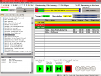
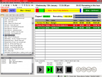
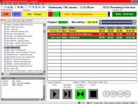
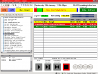
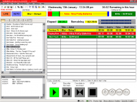
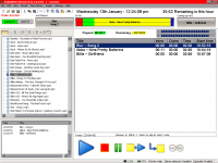
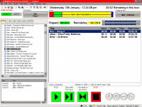
Regarding the graphical layout, may I propose that the progress bar be changed to show a graphical display of the total song duration the elapsed time, remaining time, song intro, and outro information.
The red section indicates the duration of the intro, the green is the duration so far, the yellow indicates the the remaining duration until the crossfade point, the blue shows the remaining time from the crossfade point to the actual end of the song.
With this sort of display there remains the question of what actual numeric information is superimposed over each section, or whether the duration and remaining times could or should be separate.
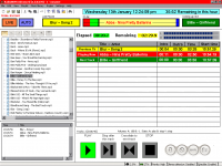
I have experimented with other graphics as you can see, and have added a "Just Played" section as well.
EDIT
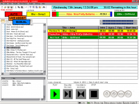
Added another .png file
Chris in New Zealand
Regarding 4.5.0.678 Beta, I offer these comments for your consideration.
First some compliments;
From a development perspective the automatic save feature for profile modifications is excellent.
The ability to disable various options including the progress bar is good.
Now some suggestions;
Regarding the graphical layout, may I propose that the progress bar be changed to show a graphical display of the total song duration the elapsed time, remaining time, song intro, and outro information.
The red section indicates the duration of the intro, the green is the duration so far, the yellow indicates the the remaining duration until the crossfade point, the blue shows the remaining time from the crossfade point to the actual end of the song.
With this sort of display there remains the question of what actual numeric information is superimposed over each section, or whether the duration and remaining times could or should be separate.
I have experimented with other graphics as you can see, and have added a "Just Played" section as well.
EDIT
Added another .png file
Chris in New Zealand
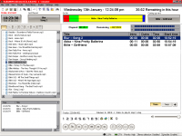
") And, removing this will make UI look very "still".
And, removing this will make UI look very "still".