When this option is set to True, RadioBOSS will sort the file list alphabetically. If it's set to False, it will use the list as-is. The list itself is supplied by the Windows system.If set to false, the titles should not be sorted and should be added to the playlist in the same order as they appear in the folder.
Even if set to false, the titles are always sorted alphabetically
You are using an out of date browser. It may not display this or other websites correctly.
You should upgrade or use an alternative browser.
You should upgrade or use an alternative browser.
RadioBOSS 7.2 [beta]
- Thread starter djsoft
- Start date
- Status
- Not open for further replies.
patrick.de-bruyn
Active member
That's exactly what I meant, but that's not the caseWhen this option is set to True, RadioBOSS will sort the file list alphabetically. If it's set to False, it will use the list as-is. The list itself is supplied by the Windows system.
It's ALWAYS sorted alphabetically; whether it's set to true or false makes no difference
Last edited:
patrick.de-bruyn
Active member
https://www.youtube.com/watch?v=EPor0-pYGeQThat's exactly what I meant, but that's not the case
It's ALWAYS sorted alphabetically; whether it's set to true or false makes no difference
Then it means Windows already provides a sorted list. Again, "Drag-and-Drop – Sort titles alphabetically" is True = RadioBOSS sorts, False = RadioBOSS does nothing.That's exactly what I meant, but that's not the case
It's ALWAYS sorted alphabetically; whether it's set to true or false makes no difference
patrick.de-bruyn
Active member
Apparently, this is a quirk of Windows 11. I only recently switched to Windows 11; with Windows 10, this wasn't a problem.Then it means Windows already provides a sorted list. Again, "Drag-and-Drop – Sort titles alphabetically" is True = RadioBOSS sorts, False = RadioBOSS does nothing.
There doesn't seem to be a general solution—at least, I haven't found one.
So it is NOT a RadioBOSS error.
patrick.de-bruyn
Active member
The weather data is not displayed below the time, yes it is turned on
")

cristianpeyran
New member
radiotelevision
New member
No problem with the weather here
You need to ensure the weather data is retrieved - in Settings > Weather specify the location. Also the weather data is not displayed if the top panel is very narrow (so called "minimal" mode) where only time is shown.The weather data is not displayed below the time, yes it is turned on
Thank you, we'll check what could be wrong there.Hello Team,
Bug Report:
Segue Editor: the next song doesn't respect the starting point and begins playing wherever play is pressed. This prevents creating a proper custom mix.
cristianpeyran
New member
Hi team,
I found a new bug in IntroAuto; instead of lowering the volume during the track, it lowers it at the end.
I found a new bug in IntroAuto; instead of lowering the volume during the track, it lowers it at the end.
Please confirm what RadioBOSS version you use. Where is the Auto Intro positioned?I found a new bug in IntroAuto; instead of lowering the volume during the track, it lowers it at the end.
cristianpeyran
New member
Hi!Please confirm what RadioBOSS version you use. Where is the Auto Intro positioned?
Vers: 7.2.0.8
It doesn't always happen; I can't identify what triggers the bug, I'm trying to figure it out. I'm using it live on the radio. I understand the risks, but I think it's the best way to test it, in a real-world environment.
tomimatko
Active member
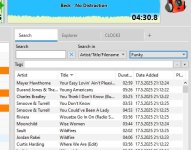
Someone already mentioned this on the forum - the tabs in the new version are poorly designed. They’re almost invisible. You can’t clearly distinguish one tab from another, and they’re nearly the same color as the background.
Something should definitely be done about this. Maybe add a darker border to the tabs, like in the previous versions.
Something should definitely be done about this. Maybe add a darker border to the tabs, like in the previous versions.
Attachments
Last edited:
tomimatko
Active member
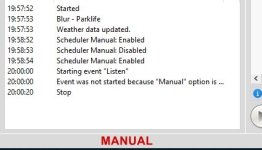
Also, when Manual Mode is enabled and the (MAN) indicator appears in the top-right corner next to “Scheduler Enabled” and “Silence Detector Enabled” it’s barely visible - it gets lost instead of being clearly readable.
There’s a real risk that it could be forgotten, which could result that ads not being played.
I suggest moving it to the status bar on the left side, below the Scheduler and Log windows. That would be much more logical - and I’d even make the label bold (or even even colorcode) to ensure it stands out clearly. See picture.
Attachments
patrick.de-bruyn
Active member
the weather data is not displayed if the top panel is very narrow (so called "minimal" mode) where only time is shown.
Thanks i diddnt see where to make the top panel bigger
Problem solved
Thanks i diddnt see where to make the top panel bigger
Problem solved
Thank you, we'll check what could be wrong there.It doesn't always happen; I can't identify what triggers the bug, I'm trying to figure it out. I'm using it live on the radio. I understand the risks, but I think it's the best way to test it, in a real-world environment.
Yes, the Minimal mode hides the second line from the clock area (where the weather is displayed) and also box titles at the top.the weather data is not displayed if the top panel is very narrow (so called "minimal" mode) where only time is shown.
Thanks i diddnt see where to make the top panel bigger
Problem solved
The design merely matches the current Windows design. How it's done in Windows 11.Someone already mentioned this on the forum - the tabs in the new version are poorly designed. They’re almost invisible. You can’t clearly distinguish one tab from another, and they’re nearly the same color as the background.
Microsoft Edge:
Windows Explorer:
Opera web browser (non-Microsoft product - but you see the design is practically the same):
Tabs in RadioBOSS with the default style:
The point is, we have to move out of the 2010 era design trends. As you see, there's noting unique with RadioBOSS tabs. It just follows the current design trends. But, there are Style options that allow customization of the tabs (unlike the examples above where you can't control the look).
I guess we'll add an option to enable tab frames and maybe some other style options. But not radically change it, and of course not going back to "old design"
I think in the future it will be changed. One of the solutions we're exploring for RadioBOSS 7.3 is a general mode switcher somewhere in the top corner that sets multiple options at once (e.g. Manual in the Scheduler, Stop after this track, Repeat playlist, etc.) e.g. LIVE-MANUAL-AUTO modes where you can set what each mode does - for instance, MANUAL enabling both Manual mode in the scheduler and Stop after this track option. But in this 7.2 version, no major change like this is possible at this point.I suggest moving it to the status bar on the left side, below the Scheduler and Log windows. That would be much more logical - and I’d even make the label bold (or even even colorcode) to ensure it stands out clearly. See picture.
RadioBOSS 7.2.0.9 beta
Changes
x86 https://dl.djsoft.net/beta/radioboss_setup_7.2.0.9.exe
x64 https://dl.djsoft.net/beta/radioboss_setup_7.2.0.9_x64.exe
Changes
- Redesigned the Advanced Settings window
- Added advanced option: do not remove track in Queue Mode on manual track switch
- Improvements in the tab control design; a frame is added if inactive tab's color is customized; more options added in Style section for the tabs (frame color)
- Scheduler option added (Settings): send Overlay event titles when Relaying
- Other UI improvements and minor bugs fixed
x86 https://dl.djsoft.net/beta/radioboss_setup_7.2.0.9.exe
x64 https://dl.djsoft.net/beta/radioboss_setup_7.2.0.9_x64.exe
tomimatko
Active member
Yes, the tabs now look much better and are clearly distinguishable from one another.RadioBOSS 7.2.0.9 beta
Changes
- Improvements in the tab control design; a frame is added if inactive tab's color is customized; more options added in Style section for the tabs (frame color)
- Status
- Not open for further replies.
Similar threads
- Replies
- 18
- Views
- 2K
- Replies
- 527
- Views
- 109K