Some requests for future updates

Hi, here are three things I would like to see in future versions of RadioBOSS.

1) Allow to automatically skip an Audio File if marked as News, Weather Bulletin or any other source of information for the public, if (for example) more than 60 minutes (1 hour) have passed since its last file modification.
This is because for a commercial streaming radio it is important to have the news updated, and often, 60 minutes later, the news are considered old or in any case not updated.
So just a button to enable on the single audio file (from TrackTool) that says: "If 60 minutes old, skip the on-air playback", then RadioBOSS will move on to the next element.
This avoids for example to also broadcast the opening/closing themes of the Radio News/Weather.


2) Quickly see how many tracks a certain category contains, without actually opening it.
Often when we update music, I literally have to know (before moving a song) how many tracks are in a certain category, if I'm satisfied, only then will I move the song.
This quick action is currently not possible, since I first have to open the category and read how many songs are in it.
And then, move to the other category to select the song and move it back.
It would be enough to also indicate, via brackets, when you pass over the "Move" option, the number of songs in that category.
Maybe also add a confirmation button, before moving the element.
Add, maybe even by default, the "Null" or "All" category where all the songs that you import the first time when you open the Music Library automatically end up.
Currently I had to create a generic category to group all the songs.
But this can be annoying for some.


3) Really see the history of the songs on the categories.
So, for example, in the summer, see song by song how long they have been in high rotation. And then, how many days were in another category.


I hope I made myself clear with the translation,
Let's see what other users think and especially if it can be useful to you too.


Any advice is welcome.
Thanks
 
1) Allow to automatically skip an Audio File if marked as News, Weather Bulletin or any other source of information for the public, if (for example) more than 60 minutes (1 hour) have passed since its last file modification.
This is because for a commercial streaming radio it is important to have the news updated, and often, 60 minutes later, the news are considered old or in any case not updated.
You can use the getfile command for this - with delete file after playback option. This can be configured using the Scheduler Wizard. E.g. you make it play news 2-3 (as needed) times, and the last playback is done using the getfile command, deleting the file. Then in will play nothing until a new news file is added.

2) Quickly see how many tracks a certain category contains, without actually opening it.
There are no categories in the Music Library. It has Tags but it's not mandatory to use them and meaning of the tags can be anything (categories or whatever else).
You can use the Filters to see how many tracks are there for each tag.

3) Really see the history of the songs on the categories.
So, for example, in the summer, see song by song how long they have been in high rotation. And then, how many days were in another category.
You can use the Report Generator for that: https://manual.djsoft.net/radioboss/en/report_generator.htm
 
There are no categories in the Music Library. It has Tags but it's not mandatory to use them and meaning of the tags can be anything (categories or whatever else).
You can use the Filters to see how many tracks are there for each tag.
So what exactly is Music Library for? Where are the actual categories on RadioBOSS? On PLG Pro, there is a "Global Category" feature, what is it for? Thanks
 
So what exactly is Music Library for? Where are the actual categories on RadioBOSS? On PLG Pro, there is a "Global Category" feature, what is it for? Thanks
Music Library is keep track of your music for search/bulk edit/analytics purpose. Categories can be created (global or not) in the Playlist Generator and based on them you can create playlists.
 
Could the possibility of putting %tags in the title format be added?

Captura de pantalla 2025-05-13 151622.png
 
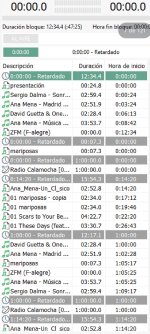
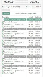
Hi, I'd like to know if it's possible to display the event scheduler section in blocks of time in the future? Or if there's an option to alternate the current display or block-based display. This would be a visual improvement and easier to understand. Something like the attached image.
 

Attachments

  • IMG_20251018_062939.jpg
    IMG_20251018_062939.jpg
    335.6 KB · Views: 20
Hi, I'd like to know if it's possible to display the event scheduler section in blocks of time in the future? Or if there's an option to alternate the current display or block-based display. This would be a visual improvement and easier to understand. Something like the attached image.
I'm not sure but I guess the same effect can be achieved by sorting the scheduled events by Run In or Next Run column.
 
I'm not sure but I guess the same effect can be achieved by sorting the scheduled events by Run In or Next Run column.
Honestly, it doesn’t look the same or similar — it looks very disorganized, and the order of events isn’t clear. I think it would be a great visual improvement to arrange them the way I showed in the previous message, since it looks much simpler. Additionally, it would be better to display only the events for the current day.
I made the changes you mentioned, but visually it’s quite hard to understand. I’m showing a picture of how it currently looks
1760788756324.png
 
it looks very disorganized, and the order of events isn’t clear
I'm not sure about it. The order of the events is pretty clear. Events are sorted by their launch time.

I made the changes you mentioned, but visually it’s quite hard to understand.
What information is hard to understand? The list looks pretty good. You may hide one of the columns, as "Run In" and "Next Start" are pretty much the same (Run In = Next Start - Current Time).
 
Hi, I'd like to know if it's possible to display the event scheduler section in blocks of time in the future? Or if there's an option to alternate the current display or block-based display. This would be a visual improvement and easier to understand. Something like the attached image.
I find @xzsaimon16 's proposal interesting for advertisements only because it would allow us to see the names of the elements to be broadcast (artist name, track title, etc.).

Currently, in the event scheduler, we have the ability to verify that an ad screen (a block) is correctly scheduled.
However, we can't see what it contains: the "Name" column only indicates [AdScheduler].
This makes sense, as it's an advertising event.
In this column, we could add the profile name: [AdScheduler] – Profile Name (or default)? To provide an initial breakdown of an advertising event.

Then, the idea would be to get an overview of what each advertising event contains, for example, by adding a "detail" column that displays the elements (Artist Name and Track Title) in chronological order, separated by a ";" or "/" separator:
Advertisement01-Spot01; Advertisement02-Spot02

The best option would be to display the elements one below the other, as in the proposal. This would require as many additional lines as there are elements in the block.
But I think the event scheduler is designed to display one event per line...
 
I'm not sure about it. The order of the events is pretty clear. Events are sorted by their launch time.


What information is hard to understand? The list looks pretty good. You may hide one of the columns, as "Run In" and "Next Start" are pretty much the same (Run In = Next Start - Current Time).
Currently, the scheduled ad events in RadioBOSS appear as separate items in the Events list, which makes it difficult to visualize the overall daily structure.

I suggest that the Event Scheduler should include an hourly block view (for example, each hour or ad break shown as a grouped block), where:

Each block (e.g., “18:30 – Ad Block”) acts as a visual header.

Under each block, the tracks or ads included are displayed with indentation and type icons.

Blocks can be collapsed or expanded, allowing a compact or detailed view.

Option to show only today’s blocks or filter by time range.

The same editing and scheduling functions would remain available, but with a clearer hierarchical layout.


Benefits:

Immediate clarity: the operator can see what will air in each hourly block without opening multiple events.

Better visual control over the daily schedule.

Reduces duplication or timing err
ors in ad scheduling.
 
In this column, we could add the profile name: [AdScheduler] – Profile Name (or default)? To provide an initial breakdown of an advertising event.
This can be implemented, from Ads Scheduler side, so that it exports events with profile name included in the event name.

Then, the idea would be to get an overview of what each advertising event contains, for example, by adding a "detail" column that displays the elements (Artist Name and Track Title) in chronological order, separated by a ";" or "/" separator:
Advertisement01-Spot01; Advertisement02-Spot02
If it's a single line then it would need to be very wide, otherwise you will only see 1-2 names and it's not really useful.

The best option would be to display the elements one below the other, as in the proposal. This would require as many additional lines as there are elements in the block.
But I think the event scheduler is designed to display one event per line...
Yes, it's one per line and also Ads Scheduler usually creates lots of events, expanding each of them is not practical and will result in massive vertical scroll.

What you need is already possible: if you hover the mouse over the Action column, it shows event's actions. If there are multiple actions, it shows all of them, separated by a pipe ("|") symbol. It does not expand playlists though.
 
Currently, the scheduled ad events in RadioBOSS appear as separate items in the Events list, which makes it difficult to visualize the overall daily structure.
With group display turned off and sorted by Next Run you clearly see what events are about to start.

Each block (e.g., “18:30 – Ad Block”) acts as a visual header.
You can configure the Ads events to have a different color to make them more prominent in the list: Ad Scheduler, Settings, Event Properties, Colors.

Under each block, the tracks or ads included are displayed with indentation and type icons.
As stated above, this will hugely increase the list size. I think some sort of "Event preview" can be created, as a popup window or some similar solution. It has to be limited (e.g. do not execute certain commands from there), but will provide a general look at what is about to start.

Option to show only today’s blocks or filter by time range.
Yes, as there are already filters, a new filter can be added like "Show only events that start within X hours". What do you think?
 
With group display turned off and sorted by Next Run you clearly see what events are about to start.


You can configure the Ads events to have a different color to make them more prominent in the list: Ad Scheduler, Settings, Event Properties, Colors.


As stated above, this will hugely increase the list size. I think some sort of "Event preview" can be created, as a popup window or some similar solution. It has to be limited (e.g. do not execute certain commands from there), but will provide a general look at what is about to start.


Yes, as there are already filters, a new filter can be added like "Show only events that start within X hours". What do you think?
Yes, that’s fine. But I find it visually easier and more understandable in the proposed layout (first screenshot).

In particular, the advertising spots can be viewed in more detail by double-clicking on the corresponding block (thus eliminating the long list you mentioned). Additionally, a column could be added for the duration of each block—let’s look at the example in this screenshot.

IMG_20251021_224143.jpg

You can see a very specific order by time blocks, which makes it easier to understand and speeds up the handling and control of ads directly from the scheduler. You can see the duration of each advertising audio and its corresponding name...

Not many changes are needed—it would just involve adding columns and arranging the events in the proposed format.

An extra detail is that the ad scheduler could include an auto-scroll feature focusing on the next block to be played.

I find it much more user-friendly and convenient than just using colors and sorting by the current columns.


It's just a suggestion. Currently, ads are displayed differently, and not all scheduled events are shown sorted by "next run." The screenshot shows only the timing of some events, not all.
 
Last edited:
If it's a single line then it would need to be very wide, otherwise you will only see 1-2 names and it's not really useful.
Yes, it would be very long if there are several names and not very readable. Thank you for your perspective.

What you need is already possible: if you hover the mouse over the Action column, it shows event's actions. If there are multiple actions, it shows all of them, separated by a pipe ("|") symbol. It does not expand playlists though.
Action: this displays the day number, day, hour or minute of the profile and the path of the file on the computer. It does not enlarge the playlists and it actually misses, in my opinion, the most important thing: the elements, the spots…
 
Yes, as there are already filters, a new filter can be added like "Show only events that start within X hours". What do you think?
Yes, this would allow us to have a more precise vision over a period of time that we could define.

And in this case, is it possible to set up a vertical display solution to see the details of advertising events when this new filter is activated? As proposed by @xzsaimon16 , seeing the names of the audio tracks and their durations would allow us to have a visualization of what we will broadcast.

Especially when we are on broadcast and live. For example, there is a promotional spot for an event in an advertising block, I do not want the DJ to talk about this event just before to avoid unnecessary repetition.
Currently, I open the AdsScheduler to see what items will be served.


Starting from the proposal for a pop-up window mentioned above, I suggest adding a new “preview (or another name)” tab which would satisfy a large part of us.

In this tab, future elements of scheduled events are displayed:

One block per event.
Block detail:
Name of the profile + planned start time for broadcast + Actual duration of the block (take into account the “Start Mix” and “Mix Point” points)​
Details: name of elements planned for broadcast + Duration. Vertical display: one line per element.​
End time scheduled at the end of broadcast.​


I will have a clear and detailed vision.
I will no longer have to go see the AdScheduler. Everything would be displayed in the main window thanks to this new tab.

In addition, this would avoid overloading the event planner with multiple “useless” lines for some users. I think these users don't care about seeing all the details...
This idea is inspired by ZaraStudio 4, which uses a very intuitive way to visualize and organize daily blocks of events. However, I believe the concept originally came from DinastyMax 3, which, in my opinion, had one of the best event editors ever made.

In DinastyMax, it was possible to drag and drop elements such as ad audio files, jingles, or commands directly into the event editor. This made the workflow faster, more visual, and much easier for the user.

For now, this proposal focuses only on a visual adjustment rather than changing the entire workflow. The main idea is:

1) Add tabs or collapsible sections in the Event Scheduler to show only ad blocks (events).

2) Each block would appear as a clickable header that can expand or collapse to reveal the individual elements (ads, jingles, commands, etc.) contained inside.

3) This structure would give the user instant visual control over the daily schedule.


Example:

If today has 24 hours but only 12 advertising blocks are configured, RadioBOSS could display those 12 blocks, grouped and ordered by hour, similar to how it appears in ZaraStudio (as shown in the screenshot).

Using a “Show Only Today” filter, the interface would focus only on the current day’s schedule, making it clean, simple, and efficient to navigate.

In summary: This proposal aims to enhance the user interface of the Event Editor by:

Organizing events into collapsible time blocks,

Providing clearer visual separation,

And improving usability while maintaining the current event logic.


It’s not a major functional change — just a visual and workflow improvement that would make daily sch
eduling much more intuitive.
 
Back
Top