xzsaimon16
Active member
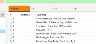
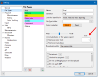
And how would the “tracklist” element be added? Also, some icons are missing, such as: comment, lightning bolt (I use it for IDs), etc.You can create a file type for such items and assign icons for them.
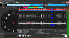
Yes, splitting provides an additional workspace. This is very useful when working with two monitors, since I can have, for example, the library, the log, and the ad scheduler on the screen at the same time. In my case, it’s extremely useful, because on the main screen I would use only the playlist window.I'm not sure, what this option should do? It allows you to enable work zones, it's effectively splitting the window.
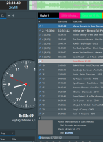
Yes, I think it’s missing something like a text label that says “intro”.Do you mean Auto Intro? If so, when it's playing it shows countdown.
It’s not especially useful; it’s just that, as part of the visual improvement of RadioBOSS, a smooth transition would look very nice. For the Now Playing bar, I would like that transition to be implemented; it could even be from bottom to top. In the playlist, I don’t think it’s necessary.I'm not sure about this, playlist is just scrolled (by default) when a new track starts, and nowplaying displays new track information. The Nowplaying bar can show a sort of animation, like scroll to the left, but I'm not sure about usefulness of this")