Do you mean this feature should be extended to check more days, not only yesterday?
This is what "Do not play track at the same time..." option does, or am I misunderstanding something?
From your responses, I get the impression that I'm the one who doesn't quite understand how this new option works

Let's take the following example:
It's Thursday, February 19th.
The "Do not play tracks at the same time as yesterday" box is checked (Playlist Generator > Settings).
Then, I click on "…" to set the number of minutes before and after. In this example, 90 minutes for "Before" and 90 minutes for "After".
On Wednesday, February 18th, track A is broadcast three times during the day:
6:00 AM, 12:00 PM, and 6:00 PM. 6:00 PM is the time of the last time track A is played for Wednesday, February 18th.
I interpreted this new function as follows:
For Thursday, February 19th, track A can be played:
- Before 4:30 AM and after 7:30 AM;
- Before 10:30 AM and after 1:30 PM;
- Before 4:30 PM and after 7:30 PM.
My understanding was as follows:
- A track that was only played yesterday (Wednesday, February 18th) cannot be added to today's playlist (Thursday, February 19th) 90 minutes before or after yesterday's time (hence the word "yesterday" in the option description).
- If track B was last played on or before Tuesday, February 17th, this option will not work.
And according to your last response, this new option will only take into account the last time a track was played:
- Track A was last played on Wednesday, February 18th at 6:00 PM. Therefore, this track can only be added to the playlist before 4:30 PM and only after 7:30 PM. Unfortunately, this won't take into account the other plays during the day, namely 6:00 AM and 12:00 PM. And that's a problem…
- Track B was last played on Tuesday, February 17th (or earlier) at 3:00 PM. Therefore, this track can only be added to the playlist before 1:30 PM and only after 4:30 PM.
Or am I still misunderstanding?

I propose:
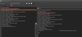
- A "Yesterday" option: All moments played only the previous day are taken into account. As I initially understood.
- A "Last time" option (or a sub-option of "Yesterday"): If a song wasn't played the previous day, only the last time it was played should be considered. Or the last two times played, which would be even better depending on the playlist rotation. Perhaps add an option to select the number of times played...
The goal is to stop or significantly reduce the listener's negative thought: "This radio station always plays this song at the same time."
If you don't want this track to play at this time at all, you should use the new feature - Dayparting, in Track Tool or Music Library you can set what hors/days of the week a track is allowed to play. This works both for the Playlist Generator and Track Tool.
This example illustrated my desire to consider the last played time.
The music track's broadcast times correspond to the correct category. However, this music track was played three times consecutively within the hour of 10 PM.
That's far too many "last plays" at the same time, especially since this music track belongs to a category that is scheduled for the morning, midday, or afternoon. And of the last five times played, this music track was played between 5:01 PM and 10:49 PM.
Currently it uses the format set in operating system, based on this, Monday or Sunday will be first day of the week. It's the same in Ads Scheduler and other places with days of the week.
It might be a bug. In the new "Dayparting" option, the list of days of the week does indeed appear from Monday to Sunday, according to my operating system.
It loads the tracks after the playing track. Maybe nothing was played or last track was playing, or the playlist was in Shuffle mode, maybe there are also other exceptions.
I don't know. It's strange; I'm using very simple test playlists.
Here's one of my latest tests with a single rotation (
See the screenshot):
- The rotation is generated directly by clicking "Generate." This displays the 12 music tracks in the playlist. Incidentally, it displays "Warning: start time is not set. Dayparting and same-time repeat protection will not work." I think this is the same problem you fixed in update 7.2.0.2 with "Generate multiple playlists." Perhaps you could add the Dayparting options to the "Settings" tab of the Playlist Generator?
- The rotation is generated from "Generate multiple playlists," and it displays 0. I notice that this time the rotation is generated 22% faster: 7 seconds instead of 9 seconds. Yet, it's the same playlist, and it was generated 15 seconds after the other one.
") Thank you for continuing to develop Time Stretch
Thank you for continuing to develop Time Stretch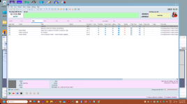
")