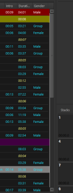
Do you refer to background color for track information or it's timer position?
I did a quick look at a couple of random competing software (both cost more than RadioBOSS). Neither offer such kind of UI customization options. Those timers are "here where we have placed them" and not changeable. I'm not sure why it's such a big deal in RadioBOSS
")
"Switch back to old" is a path to nowhere, I'm sorry. Keeping both means 2x work if any change is made/new feature added to those tabs. Even new features in this version like emoji support is not possible already with "old tabs".
Same question as above, why those tabs are such a big deal? They look good, do what they are asked for and allow customization with colors and emojis and whatever.