Sujestion for new skin of radio boss

What about the case when those items are scheduled? Should they have the "Clock" icon added to them (as it happens now with "Music note" icon) or should just those custom icons be used?
I think it should stay as it is now.
To differentiate, I’m not sure if it would be better to use an hourglass icon or some other icon that indicates that there are scheduled items. But for me, it’s fine the way it currently is.
 
Some ideas can be taken from this software called Salamandra. It’s still in development, and it’s inspired by Radioboss and Zara Studio.

1764233182327.png


I like its visual interface, which is NOT very different from RADIOBOSS. I think we could take some ideas from this software because it looks very good visually.


Specifically, the way the current track, the time, the date, the temperature, and the humidity are displayed is very well organized.


Additionally, some icon ideas like these:

1764233221451.png
 
Olá equipe de suporte, estou sugerindo a você, equipe Radio Boss, que modifique a skin Radio Boss para um formato mais profissional. Vejo que outros programas de automação melhoraram muito nesse aspecto, e embora seja tudo uma questão de marketing visual, eu não trocaria o Radio Boss por outro, mas gostaria de vê-lo renovado, com uma skin moderna e bonita. Se puder, ficaríamos felizes, porque estamos quase em 2026 e nada mudou em sua essência visual... Analise essa possibilidade, pois assim você venderá muito mais do programa de automação.
Aguarde nosso software que será lançado neste final de semana, Sao 16 temas de cores e mais 5 layouts, Muda apenas com um clique. Quaquer duvida. [advert link removed]
 
Last edited by a moderator:
Some elements not previously mentioned would be:
Icons for the following items:
playlist, station ID, folders (tracklists), teasers, commercials, commands, comments, etc.
What if it's implemented as a secondary icon, e.g. in the "Title" column or wherever. In this case, the standard icons will remain so that you can see played/scheduled/other statuses and at the same time, see another icon to better distinguish the file type/item type? In this case, we won't need to create additional states (scheduled/played/...) for custom icons.
 
I like its visual interface, which is NOT very different from RADIOBOSS. I think we could take some ideas from this software because it looks very good visually.
The interface is a copy-paste of RadioBOSS 🤷‍♂️ (and, like any software today, is black). Minor changes here and there, but this is a copy still. I honestly do not see what is "new" here, moving the temperature from left to the right in certainly not an innovation.

Additionally, some icon ideas like these:
Well, menu icons for every command is what was in the UI design guides in the beginning of 2000s. RadioBOSS also did use menu icons in the past; nowadays it looks bloated and outdated - and, in most cases, those icons do not add any additional value/information. E.g. on your screenshot, "Add random track" has a folder with a note icon - how is this associated with randomness?

But I agree some more UI icons, like for weather display, can be useful and refresh the UI. Maybe for certain menu commands as well. Or custom icons for playlist/zone tabs.

Some of the changes will be implemented in the upcoming RadioBOSS 7.2.
 
What if it's implemented as a secondary icon, e.g. in the "Title" column or wherever. In this case, the standard icons will remain so that you can see played/scheduled/other statuses and at the same time, see another icon to better distinguish the file type/item type? In this case, we won't need to create additional states (scheduled/played/...) for custom icons.

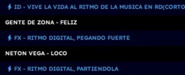
I think it could be tried. I currently use emojis, as I show in the screenshot, to distinguish the items, but they don’t display in color. Also, in each filename I have to add an emoji to tell what type of item it is. Doing this is a bit annoying because it takes a lot of time.

I think what you’re suggesting would be fine. In that case, they should be configured for each file type, and Radioboss should already have the corresponding icons set by default.
 

Attachments

  • IMG_20251128_122914.jpg
    IMG_20251128_122914.jpg
    29 KB · Views: 3
Last edited:
The interface is a copy-paste of RadioBOSS 🤷‍♂️ (and, like any software today, is black). Minor changes here and there, but this is a copy still. I honestly do not see what is "new" here, moving the temperature from left to the right in certainly not an innovation.

Yes, that’s true. But I think the empty spaces at the top of the interface could be used; placing the time and date in a larger size would look better for the user

Well, menu icons for every command is what was in the UI design guides in the beginning of 2000s. RadioBOSS also did use menu icons in the past; nowadays it looks bloated and outdated - and, in most cases, those icons do not add any additional value/information. E.g. on your screenshot, "Add random track" has a folder with a note icon - how is this associated with randomness?

The menu icons certainly aren’t necessary — I was referring more to the idea of icons that can be used for the items; I didn’t specify that, sorry.

But I agree some more UI icons, like for weather display, can be useful and refresh the UI. Maybe for certain menu commands as well. Or custom icons for playlist/zone tabs.

Some of the changes will be implemented in the upcoming RadioBOSS 7.2.

Yes, I think it’s great to have icons in the tabs for the work areas, playlist, etc. It would save space by placing icons instead of writing a name on the tabs. Some time ago, I requested that the emojis be shown in color, since I currently use emojis for that. But it’s also necessary to set the tab width to match the icon.

If you have something better in mind, then coloring the emojis wouldn’t be necessary.
 
Back
Top